Brand Refresh
GOAL
In this case our goal was brand alignment and consistency. How we communicate is as important as what we communicate. Only through steady and consistent application of the logo, its colours, typography, and supporting layout are we able to strengthen the Surrey Fire Services’ brand identity.
CHALLENGE
Taking various forms of previous artwork, and creating a strong consistent look and feel that at the same time strengthened trust within the force and community.
SOLUTION
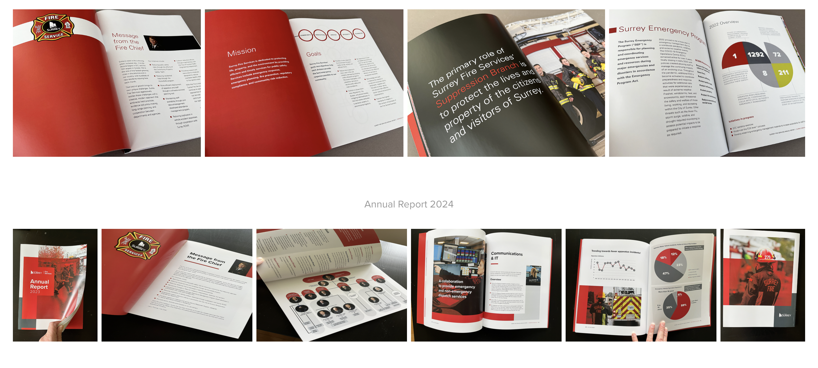
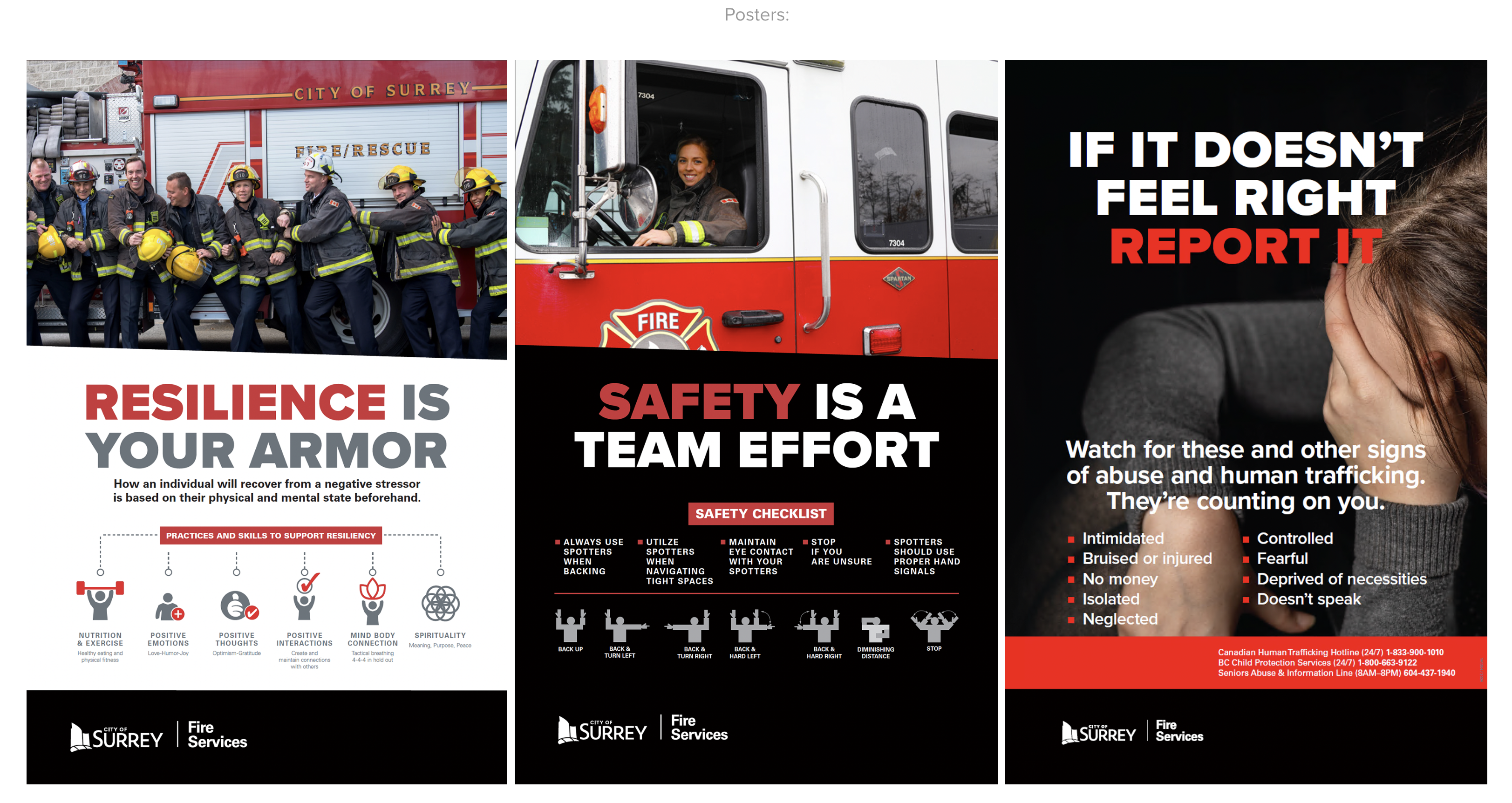
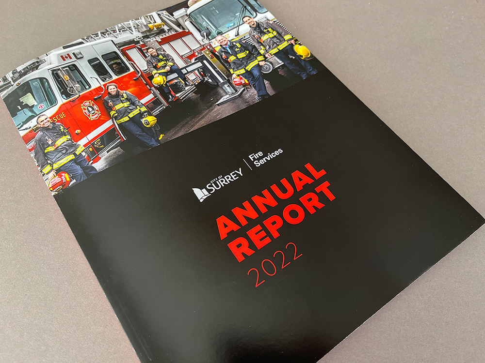
Using the City of Surrey’s Brand Architecture as a base to define Surrey Fire Services’ as a “core service”, we then aligned the elements with the City’s brand guidelines. Typestyle and a secondary palette colour were selected from the guide. An accessible option for the red was created and tested for legibility in online applications. A style was then developed for photography, which was bold and inclusive, and an illustration style and design layouts were created. These were run through all touchpoints to thread consistency to Surrey Fire’s communications in a way that would resonate with it’s audiences.
RESULTS
The brand refresh received positive feedback from Surrey Fire Services’ and through public interactions such as volunteering and recruitment.
- Identity, Brand Re-fresh
- Surrey Fire Services
- surrey.ca
- • Creative Direction & Design Lisa S Evans
- • In collaboration with City of Surrey
- • Award of Excellence: Communicator Awards